

← ASANA WEBSITE VISION
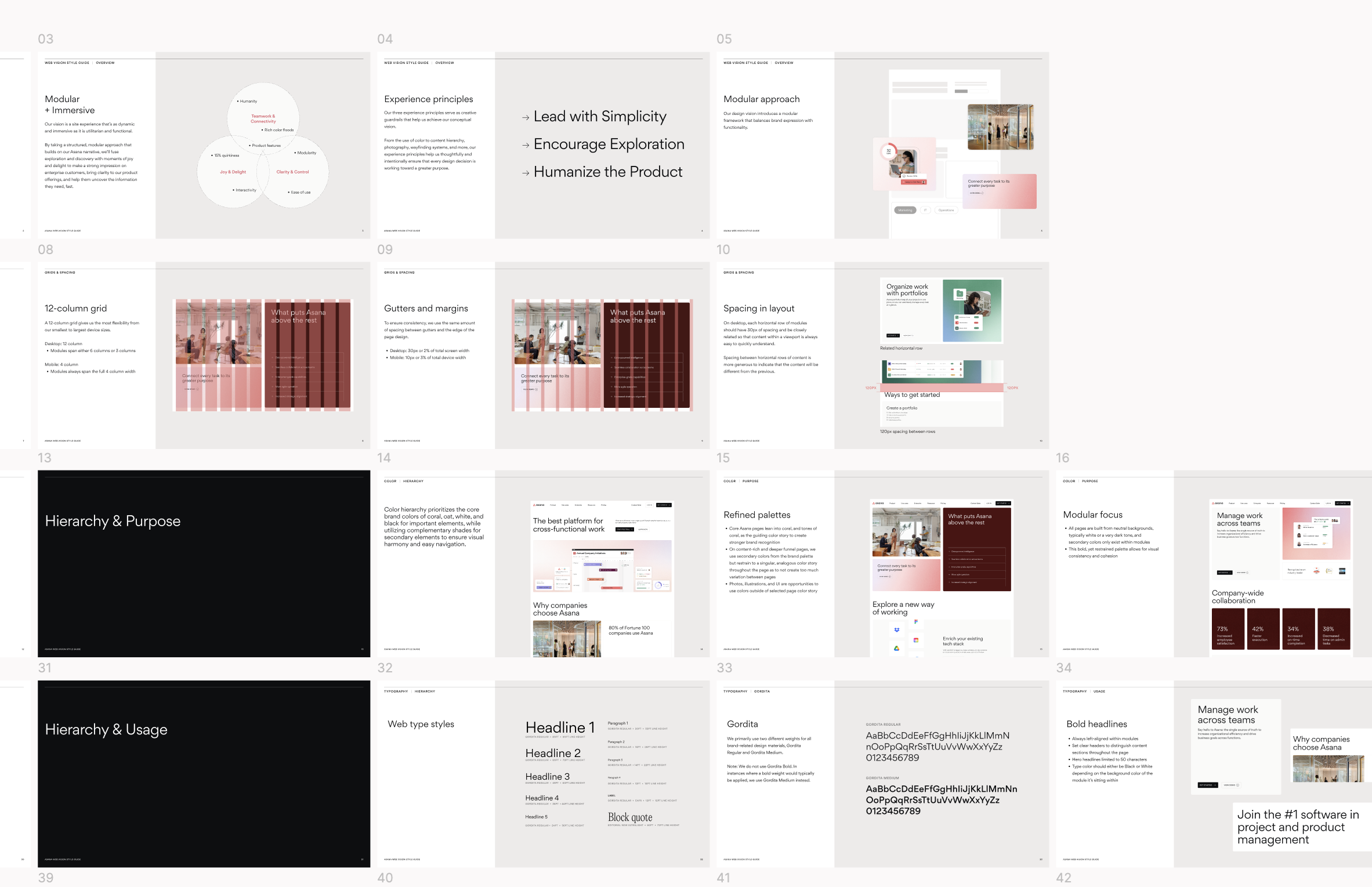
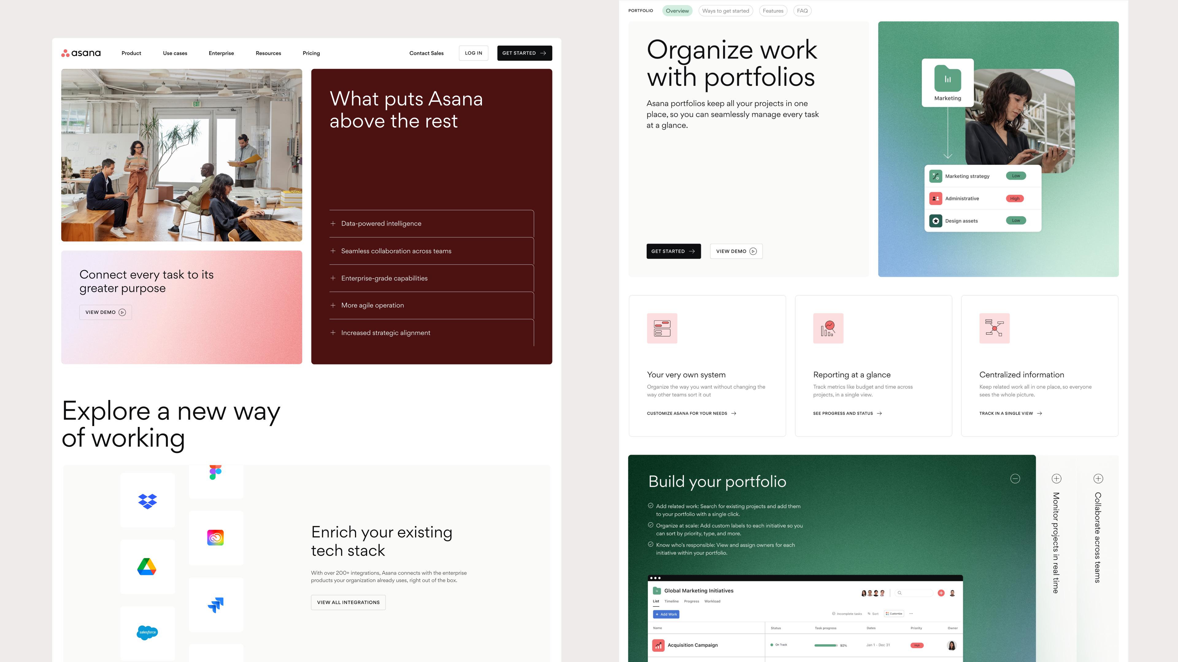
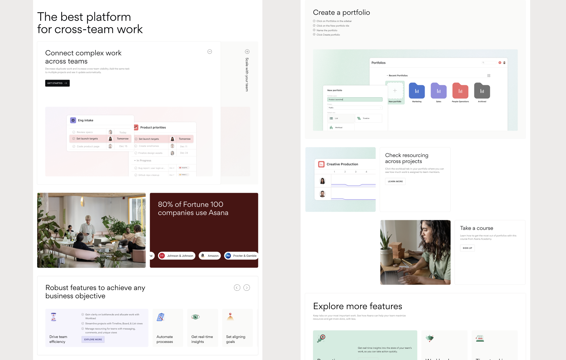
Asana approached us with a challenge: to elevate their website design to better resonate with an enterprise audience while retaining the essence of their whimsical and delightful brand. Our goal was to create a design vision that marries sophistication with Asana’s unique character.
Color: The color palette was evolved to include darker color variations of Asana’s core hues. This approach introduced a more sophisticated tone, aligning with deeper hues prevalent in competitive enterprise products. Despite this shift, Asana’s signature magical color moments remained integral through the infusion of delightful gradients, maintaining the brand’s whimsical charm.
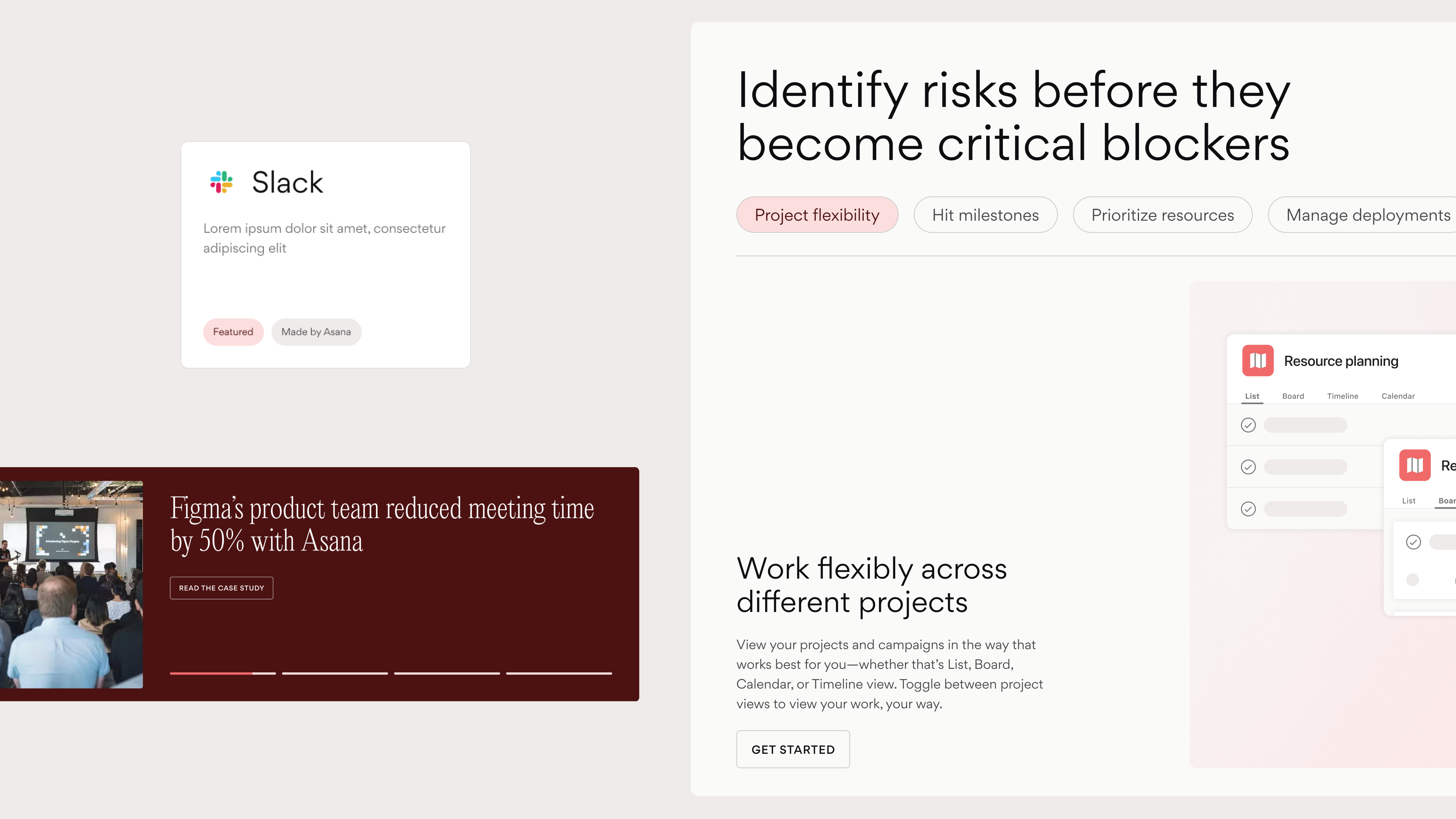
Modular Content: To streamline the development process, we crafted a modular system that allows for rapid creation of page templates. This system features adaptable content modules that range from simple to complex to accomodate all content types.
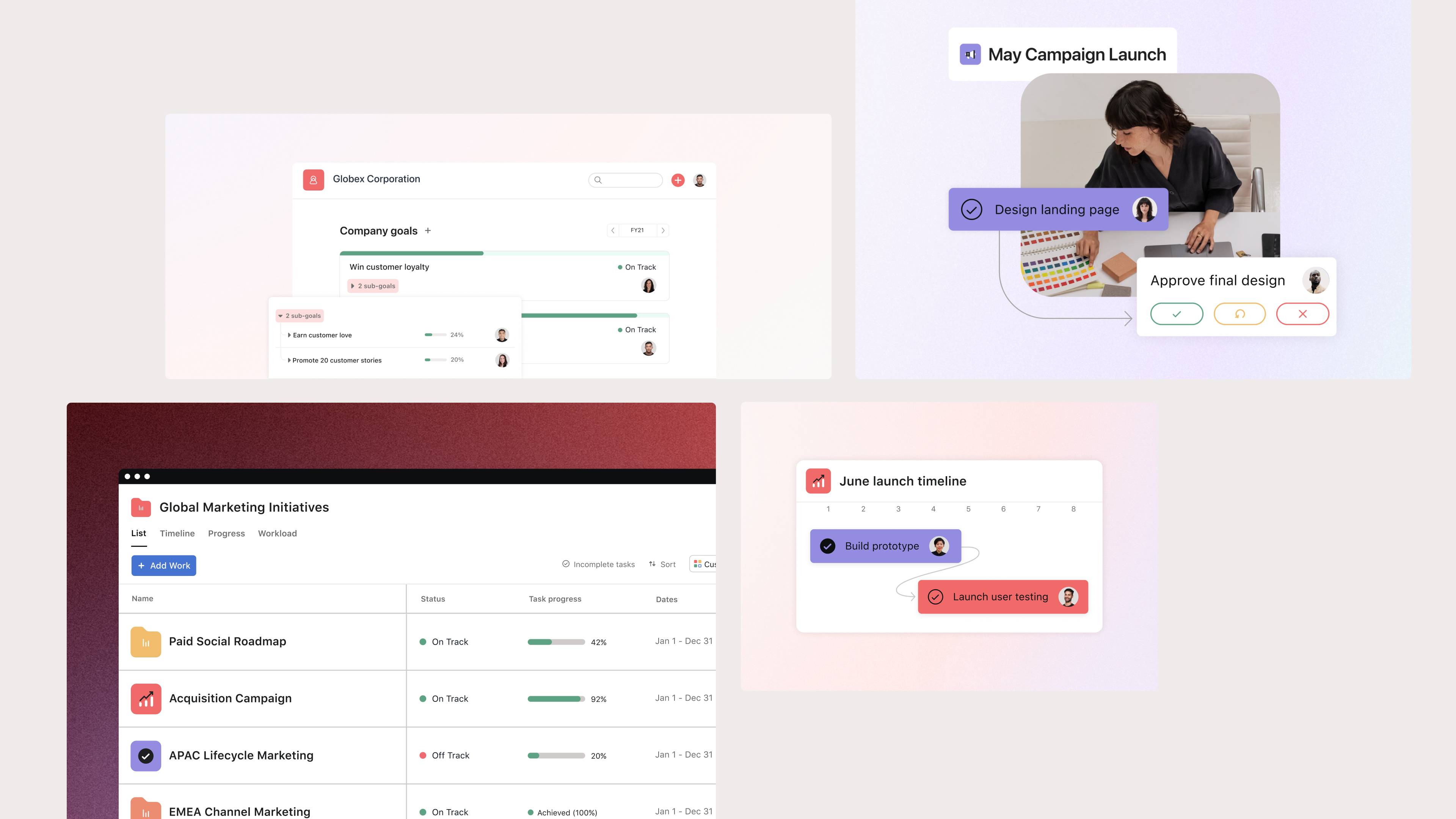
UI Illustration: The system also includes comprehensive guidelines for illustrating Asana’s UI. The approach includes a range of low-fidelity to high-fidelity. Low-fidelity visuals abstract the UI to highlight specific moments of accomplishment or collaboration within the product, while high-fidelity visuals provide a realistic preview of Asana as users explore deeper into the website content.
Agency: Instrument
Producer: Shelby Bradley
Design Director: Suzy Kim
Designers: Rosalind Chang, Franny Van Eyck
Motion: Greg Bowe
